
pika answers two questions about a pair of time series,
optionally repeated across a grouping variable (e.g. region): at what
lag are they most strongly correlated, and how does that correlation
change over time? This page is a fast tour of the core functions on the
data bundled with the package. For two full worked examples with real
data and discussion, see the case studies:
vignette("china-mobility-rt") and
vignette("wastewater-surveillance").
Lag and rolling correlation
pika bundles weekly SARS-CoV-2 wastewater concentration
and COVID-19 case counts for three US states
(wastewater_data and covid_case_data). Joining
them gives a pair of time series per state.
library(dplyr)
library(pika)

data(wastewater_data)
data(covid_case_data)

dat <- inner_join(wastewater_data, covid_case_data, by = c("state", "date")) %>%
  mutate(log_conc = log(conc), log_cases = log(cases + 1))
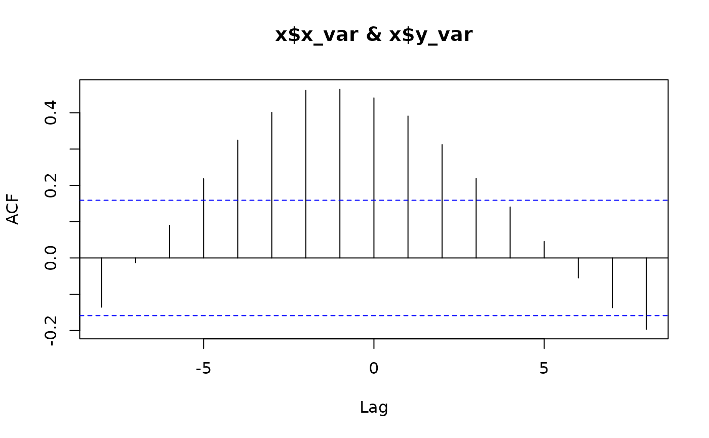
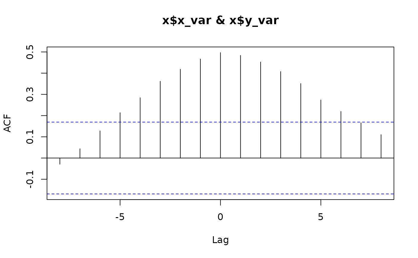
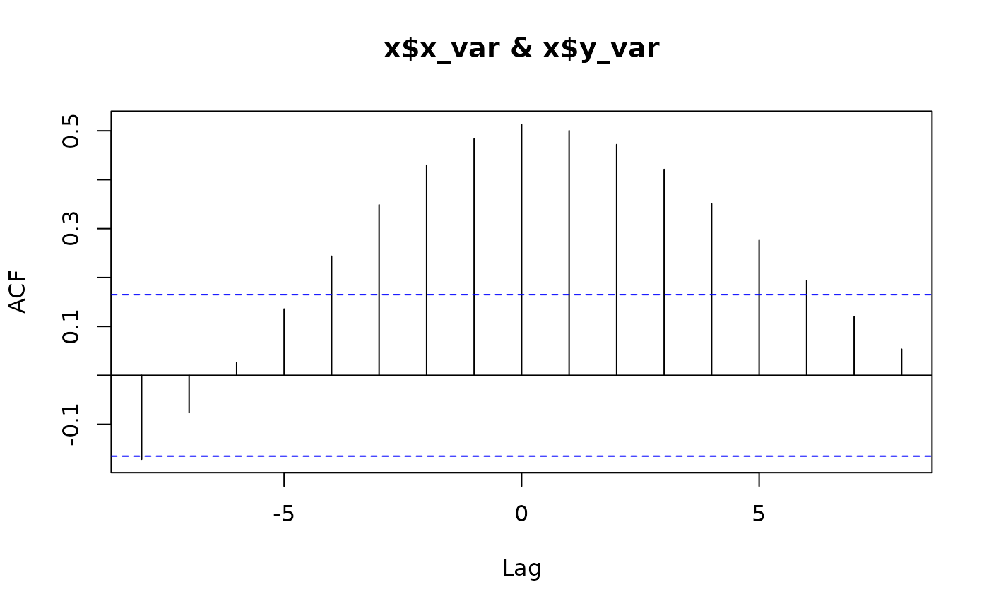
cross_corr() finds the lag (in rows of your data – here,
weeks) at which two variables are most strongly correlated, separately
for each level of grp_var:
lags <- cross_corr(
  dat = dat, date_var = "date", grp_var = "state",
  x_var = "log_conc", y_var = "log_cases", max_lag = 8
)
lags
#> # A tibble: 3 × 2
#>   state        lag
#>   <chr>      <dbl>
#> 1 California    -1
#> 2 New York       0
#> 3 Ohio           0
rolling_corr() then calculates the correlation between
the two variables in a moving window, so you can see whether that
relationship is stable over time rather than assuming a single
lag/correlation applies throughout:
dat_corr <- rolling_corr(
  dat = dat, date_var = "date", grp_var = "state",
  x_var = "log_conc", y_var = "log_cases", n = 12
)
tail(dat_corr, 3)
#> # A tibble: 3 × 9
#>   state date           conc n_sites n_samples cases log_conc log_cases roll_corr
#>   <chr> <date>        <dbl>   <int>     <int> <dbl>    <dbl>     <dbl>     <dbl>
#> 1 Ohio  2023-03-06   3.72e7      71       138  8332     17.4      9.03     0.907
#> 2 Ohio  2023-03-13   3.87e7      71       139  7586     17.5      8.93     0.942
#> 3 Ohio  2023-03-20   3.70e7      71       136  7016     17.4      8.86     0.906
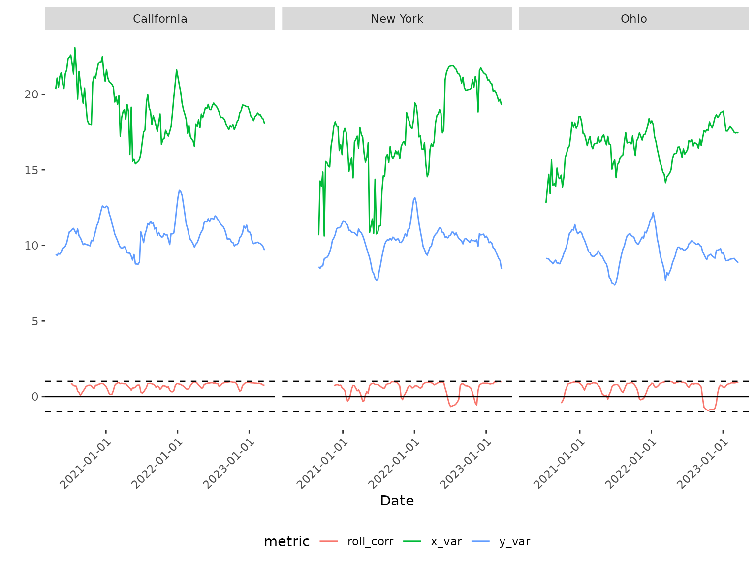
plot_corr() visualizes both series alongside the rolling
correlation, faceted by group:
plot_corr(
  dat = dat_corr, date_var = "date", grp_var = "state",
  x_var = "log_conc", y_var = "log_cases"
)
plot_lag() plots a histogram of the lags returned by
cross_corr() across groups, which is more useful with many
groups than the three shown here. Note that bins is passed
directly to ggplot2::geom_histogram()’s
binwidth, not a bin count – with only a couple of
lag values spanning a narrow range, as here, the default
bins = 2 bins everything into a single bar spanning the
whole plot, so we use a narrower value:
plot_lag(dat = lags, lag_var = "lag", bins = 1)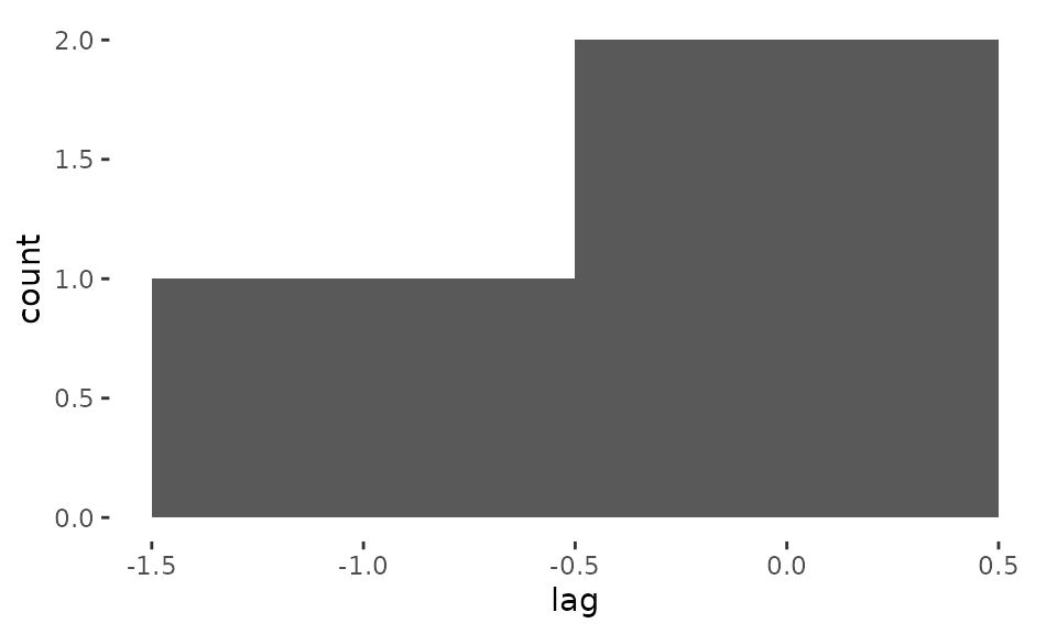
Other functions
calc_percent_change() converts a count variable into
percent change relative to the average value in a baseline period:
pct <- calc_percent_change(
  dat = wastewater_data, date_var = "date", grp_var = "state",
  count_var = "conc", n_baseline_periods = 4
)
tail(pct, 3)
#>     state       date     conc n_sites n_samples perc_change
#> 428  Ohio 2023-03-13 38665603      71       139          NA
#> 429  Ohio 2023-03-20 37030318      71       136          NA
#> 430  Ohio 2023-03-27 27581399      69        81          NA
estimate_rt() wraps EpiEstim::estimate_R()
to estimate the effective reproduction number (Rt) from case or death
counts, by group:
data(china_case_data)
rt <- estimate_rt(
  dat = china_case_data, grp_var = "province",
  date_var = "date", incidence_var = "cases"
)
tail(rt, 3)
#>     date_start   date_end      province   r_mean   r_q2.5  r_q97.5 r_median
#> 432 2020-03-16 2020-03-22 Hong_Kong_SAR 3.263403 2.791268 3.771887 3.257007
#> 433 2020-03-17 2020-03-23 Hong_Kong_SAR 3.080868 2.668662 3.522245 3.075735
#> 434 2020-03-18 2020-03-24 Hong_Kong_SAR 2.720479 2.372844 3.091530 2.716358
Learn more
For a full worked example that estimates Rt and determines its lagged
relationship with mobility, reproducing published results, see
vignette("china-mobility-rt"). For an example that tests
whether wastewater surveillance is a reliable leading indicator for
clinical case counts, see
vignette("wastewater-surveillance").