
Case study: reproduction number and mobility in China
Kylie Ainslie
2026-08-05
Source:vignettes/china-mobility-rt.Rmd
china-mobility-rt.RmdOverview
This case study reproduces the reproduction-number/mobility analysis
in Ainslie et al. (2020) [1], which
examined whether China’s COVID-19 outbreak remained under control as
social distancing policies were relaxed in early 2020, using the
relationship between the estimated effective reproduction number (Rt,
the average number of new cases generated by a single case) and
population mobility as one line of evidence. pika was
originally developed to support that analysis: estimating Rt by region,
determining the lag at which mobility and Rt are most strongly
correlated, and tracking how that correlation evolves over time via a
rolling window. Reproducing the paper’s key numbers is a useful check on
the package itself: following the same steps below on the bundled data
recovers the paper’s headline finding of a four-day lag between mobility
and Rt in Hubei province, and the same subsequent pattern of correlation
weakening and then reversing sign as movement resumed – rather than just
a workflow that superficially resembles the paper’s. This vignette walks
through that workflow – estimate_rt() ->
cross_corr() -> rolling_corr() ->
plot_corr() – on the china_case_data and
exante_movement_data example datasets bundled with the package. See
vignette("wastewater-surveillance") for the same
lag-detection and rolling-correlation workflow applied to a different
domain.
Data
pika contains several example data sets in the
data/ directory that can be used to run through the package
functions. The example data sets include 1. Daily confirmed cases of
COVID-19 from different provinces in China (china_case_data) 2. Daily
within-city movement data for the same provinces in 1
(exante_movement_data)
The case data has daily confirmed confirmed cases for different provinces in China from 16 January to 24 March 2020 from the dashboard maintained by Chinese Center for Disease Prevention and Control (CCDC) [2]. The CCDC dashboard collates numbers of confirmed cases reported by national and local health commissions in each province in mainland China, and Hong Kong SAR and Macau SAR. Confirmed cases are defined as suspected cases, who have epidemiological links and/or clinical symptoms, and are detected with SARS-CoV-2 by PCR tests. However, in Hubei province, clinically diagnosed cases were additionally included between 12 and 19 February.
The daily within-city movement data, used as a proxy for economic activity, is available from 1 January to 24 March 2020 for major metropolitan cities within each province in mainland China, Hong Kong SAR, and Macau SAR. These data, provided by Exante Data Inc [3], measured travel activity relative to the 2019 average (excluding Lunar New Year). The underlying data are based on near real-time people movement statistics from Baidu.
Estimate effective reproduction number
To estimate the effective reproduction number (Rt), pika has a
function estimate_rt() that provides a wrapper for
EpiEstim::estimate_R() [4]
that enables users to estimate Rt by a grouping variable. As input
estimate_rt() takes a data frame of daily cases or deaths
by group. pika includes an example data set
china_case_data.rda that includes daily reported cases of
COVID-19 from several provinces in China between 16 January 2020 and 24
March 2020.
| date | province | cases |
|---|---|---|
| 2020-01-16 | Hubei | 4 |
| 2020-01-16 | Guangdong | 0 |
| 2020-01-16 | Zhejiang | 0 |
| 2020-01-16 | Henan | 0 |
| 2020-01-16 | Hunan | 0 |
| 2020-01-16 | Beijing | 0 |
| 2020-01-16 | Hong_Kong_SAR | 0 |
| 2020-01-17 | Hubei | 17 |
| 2020-01-17 | Guangdong | 0 |
| 2020-01-17 | Zhejiang | 0 |
To estimate Rt from case data, the user must specify the data set in
the dat = argument of estimate_rt(). The data
set should include three columns: a date column (this should be of class
‘date’), a grouping variable, and the value used to estimate Rt (most
commonly this is cases, but other quantities can be used, such as
deaths). The names of the columns in the input data set should be
specified as character strings in the grp_var =,
date_var =, and incidence_var = arguments.
# to estimate them with pika, use estimate_rt() ------------------------------------------
rt_estimates <- estimate_rt(dat = china_case_data,
                            grp_var = "province",
                            date_var = "date",
                            incidence_var = "cases"
                            ) %>%
  # a little data formatting--------------------------------------------------------------
  mutate(province = to_snake_case(province)) %>%
  select(-date_start) %>%
rename("date" = "date_end")| date | province | r_mean | r_q2.5 | r_q97.5 | r_median |
|---|---|---|---|---|---|
| 2020-01-23 | hubei | 5.158792 | 4.718609 | 5.618324 | 5.155387 |
| 2020-01-24 | hubei | 4.572393 | 4.232182 | 4.925570 | 4.570112 |
| 2020-01-25 | hubei | 4.561455 | 4.273269 | 4.858912 | 4.559824 |
| 2020-01-26 | hubei | 4.409607 | 4.166198 | 4.659828 | 4.408408 |
| 2020-01-27 | hubei | 6.501828 | 6.246638 | 6.762055 | 6.500942 |
| 2020-01-28 | hubei | 6.117626 | 5.906827 | 6.332068 | 6.116984 |
| 2020-01-29 | hubei | 5.421957 | 5.258101 | 5.588293 | 5.421521 |
| 2020-01-30 | hubei | 4.719259 | 4.592553 | 4.847667 | 4.718960 |
| 2020-01-31 | hubei | 4.086316 | 3.987002 | 4.186835 | 4.086104 |
| 2020-02-01 | hubei | 3.743788 | 3.662311 | 3.826149 | 3.743632 |
The method used to estimate Rt can be changed using the
est_method = argument. This argument takes the following
options:
c("non_parametric_si","parametric_si","uncertain_si","si_from_data","si_from_sample").
For methods that require specifying the mean and standard deviation of
the serial interval, these parameters can be set using the
si_mean = and si_std = function arguments. The
default values are si_mean = 6.48 and
si_std = 3.83 [5].
For more information on the methodology underlying
EpiEstim::estimate_R look at this vignette
or at help("estimate_R").
Lag
When determining the relationship between two time series it is
sometimes of interest to determine the lag at which the correlation
between the two time series is highest, we’ll call this the optimal lag.
To determine the optimal lag, the two time series must first be merged
into a single data frame. We do this below using dplyr’s
left_join() by date and
province.
# Join data sets together by date and province to determine cross correlation -----------
# for this we are using input rt estimates, not those estimated using pika::estimate_rt()
data_joined <- left_join(rt_estimates,
                         exante_movement_data,
                         by = c("date","province")
)| date | province | r_mean | r_q2.5 | r_q97.5 | r_median | movement |
|---|---|---|---|---|---|---|
| 2020-01-23 | hubei | 5.158792 | 4.718609 | 5.618324 | 5.155387 | 4.792658 |
| 2020-01-24 | hubei | 4.572393 | 4.232182 | 4.925570 | 4.570112 | 3.774731 |
| 2020-01-25 | hubei | 4.561455 | 4.273269 | 4.858912 | 4.559824 | 2.573851 |
| 2020-01-26 | hubei | 4.409607 | 4.166198 | 4.659828 | 4.408408 | 2.020488 |
| 2020-01-27 | hubei | 6.501828 | 6.246638 | 6.762055 | 6.500942 | 1.876848 |
| 2020-01-28 | hubei | 6.117626 | 5.906827 | 6.332068 | 6.116984 | 1.817556 |
| 2020-01-29 | hubei | 5.421957 | 5.258101 | 5.588293 | 5.421521 | 1.766298 |
| 2020-01-30 | hubei | 4.719259 | 4.592553 | 4.847667 | 4.718960 | 1.662975 |
| 2020-01-31 | hubei | 4.086316 | 3.987002 | 4.186835 | 4.086104 | 1.603111 |
| 2020-02-01 | hubei | 3.743788 | 3.662311 | 3.826149 | 3.743632 | 1.546469 |
We can then identify the optimal lag by calculating the cross
correlation between the two time series by the grouping variable at
different lags using the cross_corr function. The argument
max_lag = specifies the maximum lag to test. In the below
example it is set to 10 days. The subset_date = argument
allows the user to determine the cross correlation between the two time
series for a subset of the time window; as in the original paper, we
focus this on the period before 15 February 2020, the peak of the
outbreak in Hubei province.
We expect changes in movement to precede changes in Rt,
since it takes time for a change in contact patterns to show up in
transmission and then in case reports, so movement is x_var
and Rt is y_var (cross_corr() restricts lags
to zero or negative, i.e. x_var at or ahead of
y_var).
# # Determine lag with max cross correlation between movement and Rt ----------------------
lags <- cross_corr(dat = data_joined,
                   date_var = "date",
                   grp_var = "province",
                   x_var = "movement",
                   y_var = "r_mean",
                   max_lag = 10,
                   subset_date = "2020-02-15"
                  )
lags| province | lag |
|---|---|
| beijing | 0 |
| guangdong | 0 |
| henan | -1 |
| hong_kong_sar | -1 |
| hubei | -4 |
| hunan | 0 |
| zhejiang | 0 |
This recovers a four-day lag for Hubei – matching the four-day lag
reported in Ainslie et al. (2020) as giving the highest correlation
between movement and Rt – and lags of zero or one day for the other
regions, also consistent with the paper’s region-specific sensitivity
analysis. Following the paper, we “backdate” the Rt estimates by this
lag (i.e. shift each region’s Rt dates earlier by
lag days, a negative number or zero, so a lag of zero
leaves the dates unchanged), without altering the dates in the movement
data, so each Rt value lines up with the movement value it is most
strongly associated with.
# backdate Rt estimates using the lag from cross_corr() ----------------------------------
data_joined_lag <- rt_estimates %>%
  left_join(lags, by = "province") %>%
  mutate(date = date + lag) %>%
  select(-lag) %>%
  left_join(exante_movement_data, by = c("date", "province"))
Percent change relative to baseline
Sometimes, it is of interest to convert a count variable over time
into a percent change based on the average value in a specified baseline
period. Using calc_percent_change() users can specify a
baseline period that will them be used to determine the percent change
in their count variable time series. This function was written for
application to mobility data, where the percent change in mobility over
time relative to baseline is of interest. However, this function can be
applied to any count type time series.
perc_change_data <- calc_percent_change(dat = exante_movement_data,
                                        date_var = "date",
                                        grp_var = "province",
                                        count_var = "movement",
n_baseline_periods = 7)| date | province | movement | perc_change |
|---|---|---|---|
| 2020-01-01 | anhui | 5.131897 | -0.0325261 |
| 2020-01-02 | anhui | 5.585968 | 0.0530762 |
| 2020-01-03 | anhui | 5.675878 | 0.0700261 |
| 2020-01-04 | anhui | 5.191629 | -0.0212653 |
| 2020-01-05 | anhui | 4.821942 | -0.0909594 |
| 2020-01-06 | anhui | 5.421992 | 0.0221631 |
| 2020-01-07 | anhui | 5.301700 | -0.0005145 |
| 2020-01-08 | anhui | 5.636145 | 0.0625356 |
| 2020-01-09 | anhui | 5.463023 | 0.0298983 |
| 2020-01-10 | anhui | 5.633986 | 0.0621285 |
Rolling correlation
It is often of interest to determine the relationship between two
time series, specifically the rolling correlation. The
rolling_corr() function calculates the rolling correlation
between two times series (x_var and y_var)
over a specified time window n =. Here, we calculate the
biweekly rolling correlation between Rt and movement. Since our data is
daily estimates of Rt and movement, we set n = 14. If our
data was monthly and we wanted to determine a 6 month rolling
correlation, we would set n = 6. The output of
rolling_corr() is a data frame with an additional column
added to the input dataset called “rolling_corr”. Depending on the value
of n, the first n values of “rolling_corr” are
NA.
# Determine rolling correlation between Rt and movement ---------------------------------
data_corr <- rolling_corr(dat = data_joined_lag,
                          date_var = "date",
                          grp_var = "province",
                          x_var = "r_mean",
                          y_var = "movement",
                          n = 14)
To visualise the rolling correlation, the results of
rolling_corr() can be plotted using
plot_corr(). This creates a plot of the two time series and
the rolling correlation between them facetted by grouping variable.
There are optional arguments to change the facet labels
(facet_lables =), legend_labels
(legend_labels =), add confidence bounds for the primary
time series (x_var_lower = and x_var_upper =),
and set a maximum value for the y-axis (y_max =). The below
code plots the mean Rt estimates with 95% confidence bands, movement
index, and the biweekly correlation between them. We also specify custom
facet and legend labels and restrict the y-axis to a maximum value of
10.
# Plot Rt, movement, and correlation ----------------------------------------------------
my_labels <- c("beijing" = "Beijing", "guangdong" = "Guangdong", "henan" = "Henan",
               "hong_kong_sar" = "Hong Kong SAR", "hubei" = "Hubei", "hunan" = "Hunan",
               "zhejiang" = "Zhejiang")
my_legend = c("Correlation", "Reproduction Number", "Movement")

plot_corr(dat = data_corr,
          date_var = "date",
          grp_var = "province",
          x_var = "r_mean",
          y_var = "movement",
          x_var_lower = "r_q2.5",
          x_var_upper = "r_q97.5",
          facet_labels = my_labels,
          legend_labels = my_legend,
          y_max = 10
          )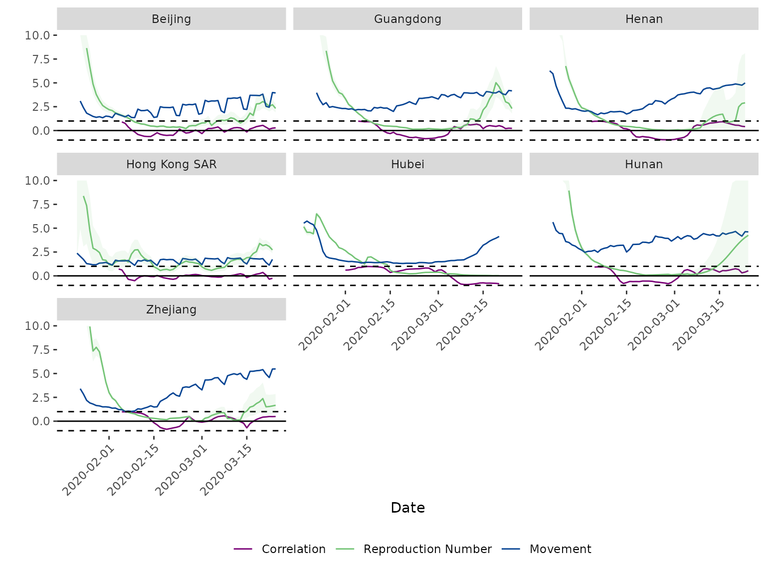
For Hubei, the rolling correlation is strongly positive (close to 1) through the lockdown period in February, then declines and turns strongly negative by mid-March as movement resumed – the same qualitative pattern described in Ainslie et al. (2020): a tight coupling between mobility and transmission while restrictions were in force, breaking down once mobility recovered while transmission remained suppressed.