Basic tutorial
Bob Verity and Keith Fraser
2020-09-19
Source:vignettes/basic_tutorial.Rmd
basic_tutorial.RmdPlasmoMAPI uses pairwise data on spatial and genetic distances to identify areas that are likely barriers or corridors of gene flow. It does this by comparing the observed distribution of genetic distances to what we would expect under the null hypothesis of no systematic spatial pattern in the data.
This vignette is intended to give a flavour for how PlasmoMAPI works and what outputs it can produce without going into much detail. For a more in-depth tutorial, including suggestions on how to ensure your results are statistically valid, have a look at the next vignette.
Creating a project and loading data
PlasmoMAPI works using projects, which are essentially just lists containing all data, input and outputs in one place. We start by creating a new project:
# create new project
p <- pm_project()
Now we need some data to work with. PlasmoMAPI requires two types of data: i) spatial coordinates (longitude and latitude) of sampling locations, ii) pairwise statistical values between all sampling locations. For this vignette we will use a dataset stored within the package, which was simulated under a simple model of P. falciparum genetics and epidemiology. Crucially this dataset was generated with a single known barrier and a single known corridor of gene flow, giving us something to aim for.
# load tutorial data
tut_data <- pm_file("general_idea_data.rds")

# load sampling coordinates into project
p <- load_coords(p, tut_data$coords$long, tut_data$coords$lat)
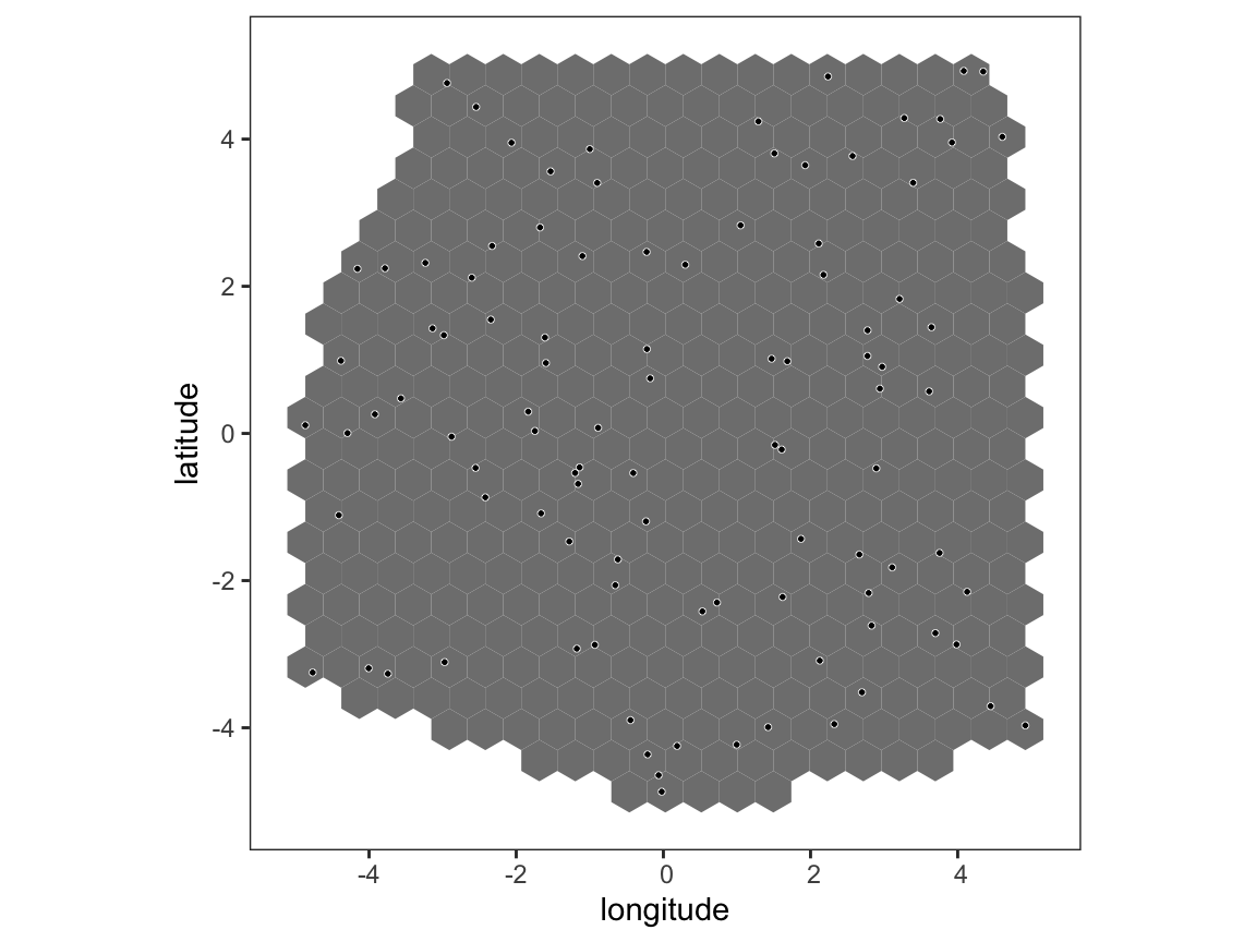
Use the sampling coordinates to define a hex map. We then “assign” the map, meaning we work out which pairwise values correspong to each hex based on an eccentricity value.
# create and assign map
p <- create_map(p)
#> Creating hex map
#> hex size chosen automatically: 0.489
#> 440 hexagons created
p <- assign_map(p, pb_markdown = TRUE)
#> Assigning edges to hexes
#>
  |
  |======================================================================| 100%

# plot basic hex map
plot(p)

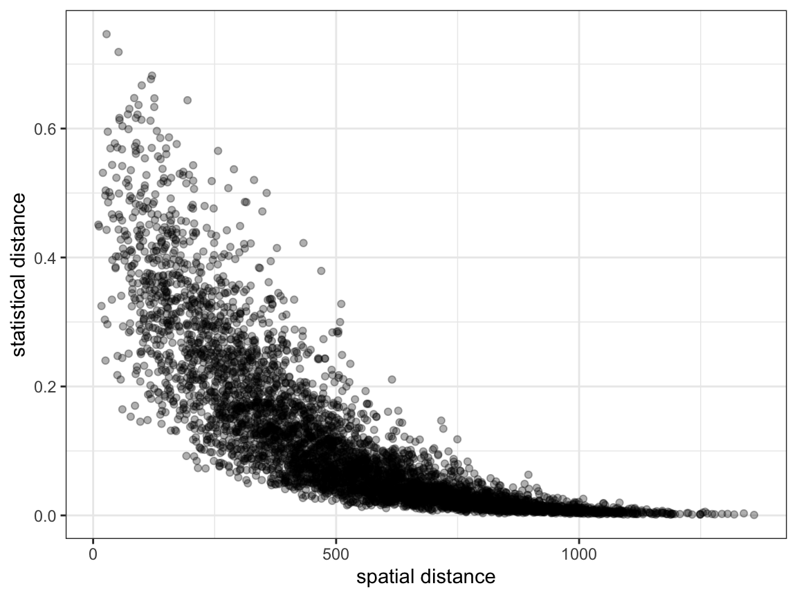
Load pairwise data, and produce a simple plot of spatial vs. statistical distance. It is very hard to see any subtle trends from this plot, as everything just looks like a cloud of data.
# load pairwise genetic distances into project
p <- load_data(p, tut_data$genetic_distance)

# plot pairwise spatial vs. genetic distances
plot_dist(p)

Run the main PlasmoMAPI analysis.
# run analysis
p <- pm_analysis(p, pb_markdown = TRUE)
#> Pre-processing
#> Carrying out permutation test
#>
  |
  |======================================================================| 100%
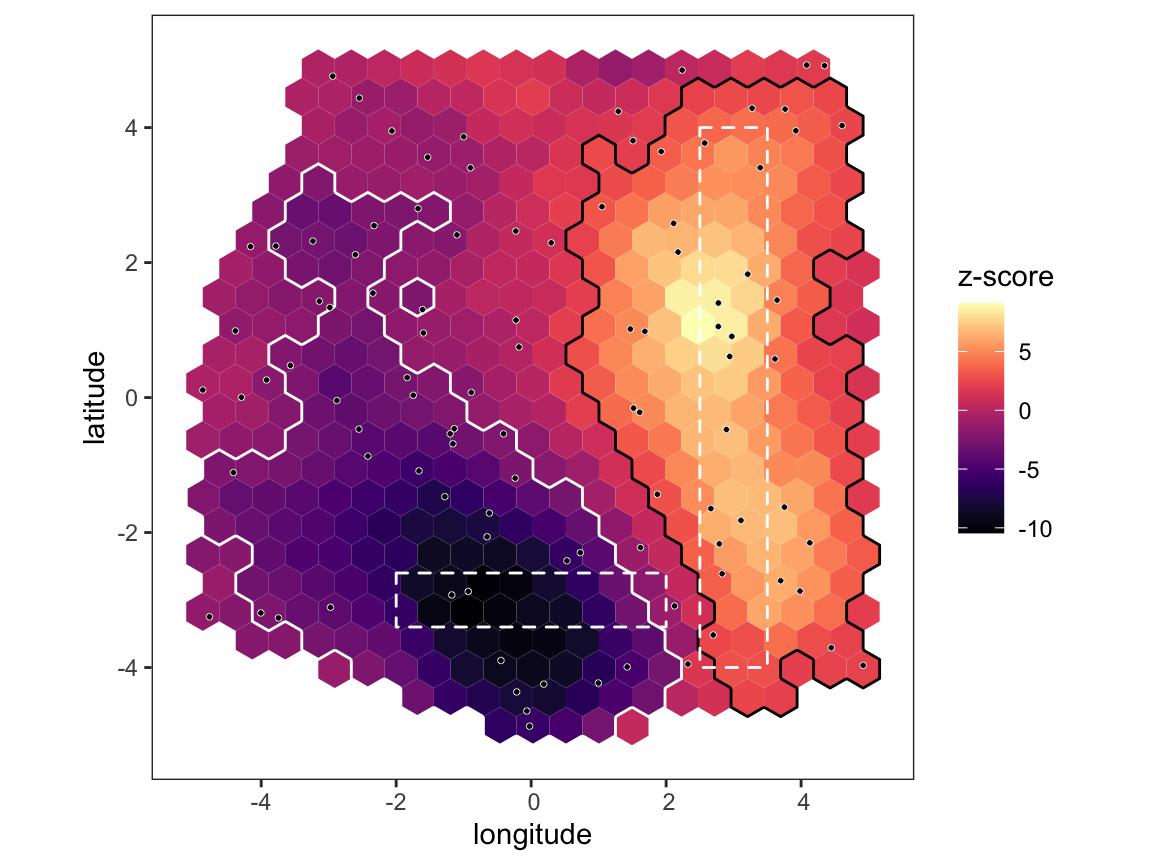
Now produce the main output of the program - a map showing the z-score of every hex compared to the null distribution. Areas that have significantly high/low z-scores are outlined in black/white, and any known features are also overlaid as dashed polygons. Note that the significance threshold takes into account multiple testing, meaning under the null model we expect to see no significant hexes 95% of the time. Hence, in this data there is actually a very strong signal of a barrier to gene flow at the bottom, and a corridor of gene flow on the right, which we know to be correct.
# plot map
plot_map(p, poly_list = tut_data$known_barriers)

We can also produce an interactive version of the same map:
# plot interactive map
plot_leaflet(p)