Using anatembea to Reconstruct Transmission Patterns: A Vignette
2026-05-08
Source:vignettes/anatembea_intro.Rmd
anatembea_intro.RmdIn this vignette, we demonstrate how to use anatembea to reconstruct patterns of transmission intensity, seasonality, and malaria burden from monthly malaria prevalence data in children under 5 years old. Later vignettes will demonstrate applying this framework to settings where pregnant women are screened for malaria (using either rapid diagnostic tests or slide microscopy) with data available at a monthly cadence as well as exploring scenarios involving different data cadences or stratifications (e.g., by gravidity).
Understanding our approach
anatembea is a tool designed to integrate dust, odin, and mcstate frameworks for fitting a semi-stochastic mechanistic disease transmission model to continuously collected prevalence data using particle Markov chain Monte Carlo (pMCMC). This package specifically fits a semi-stochastic version of the malariasimulation model to monthly malaria prevalence. While this package was designed for analysis of malaria prevalence measured among pregnant women at their first antenatal care (ANC1) visit, it can also be fit to monthly malaria prevalence in the general population. This vignette walks through a simple example fitting to simulated data from children under 5 years old and outlines various configurable options and settings.
In the deterministic version of malariasimulation, seasonal variation in malaria transmission intensity is governed by a Fourier series, with coefficients pre-estimated from historical rainfall data. While this method provides reasonable seasonal profiles for fitting cross-sectional data collected at multi-year intervals (such as data from Demographic Health Surveys or Malaria Indicator Surveys), it lacks the flexibility required for fitting models to monthly prevalence data collected through ANC1.
To enhance flexibility, we replaced the deterministic seasonal mechanism with a stochastic process. Specifically, mosquito emergence rates now vary according to a random-walk process, where the monthly change in mosquito emergence rate is modelled as: Emergence rate change = δ∼N(0,σ).
Here, σ is a volatility constant, and β, the mosquito emergence rate, is constrained by an upper limit βmax to maintain realism. The pMCMC filters likely emergence rate trajectories by comparing the observed prevalence with the model’s estimated prevalence based on these trajectories. The output is a posterior distribution of plausible model trajectories.
Since the relationship between mosquito emergence rates and infection prevalence is encoded within the mechanistic model, anatembea allows us to infer trends in key indicators like the entomological inoculation rate (EIR) and clinical incidence, which are otherwise challenging to measure directly.
Generating a test dataset
At its core, our approach leverages the established relationships between temporal infection prevalence dynamics, transmission, and clinical burden, as defined in the malariasimulation model. Consequently, we can validate the inferential framework by generating simulated datasets from the model and verifying that anatembea correctly recaptures the underlying seasonal dynamics.
For this vignette, we use a simulation based on rainfall patterns in Tanga, Tanzania, where rainfall follows a characteristic bimodal pattern. This includes:
- A short rainy season (March–May)
- A longer rainy season (November–January)
- An extended dry season (June–October)
Bimodal rainfall patterns, such as those in Tanga, often present a challenging inferential problem for many algorithms attempting to estimate seasonality. However, by applying anatembea, we aim to recapture these complex dynamics without supplying the model with prior information about the simulation parameters.
The resulting relationship between malaria prevalence in children under 5, clinical incidence, and EIR in Tanga, Tanzania is illustrated below:
library(dplyr)
#>
#> Attaching package: 'dplyr'
#> The following objects are masked from 'package:stats':
#>
#>     filter, lag
#> The following objects are masked from 'package:base':
#>
#>     intersect, setdiff, setequal, union
library(ggplot2)
library(anatembea)
data_target <- anatembea::sim_data_tanzania%>%
  dplyr::filter(month<=zoo::as.yearmon('Dec 2019'))

prev_plot_target <- ggplot(data=data_target)+
  geom_line(aes(x=month,y=prev_05_target),color="#1F78B4")+
  scale_y_continuous(limits=c(0,0.5),expand=c(0,0))+
  labs(y='RDT Prevalence,\nChildren < 5 years')+
  theme_minimal()+
  theme(axis.title.x = element_blank())

inc_plot_target <- ggplot(data=data_target)+
  geom_line(aes(x=month,y=clininc_all_target),color="#33A02C")+
  scale_y_continuous(limits=c(0,NA),expand=c(0,0))+
  labs(y='Clinical Incidence,\nall ages')+
  theme_minimal()+
  theme(axis.title.x = element_blank())

eir_plot_target <- ggplot(data=data_target)+
  geom_line(aes(x=month,y=EIR_target),color="#E31A1C")+
  scale_y_log10(expand=c(0,0))+
  labs(y='EIR')+
  theme_minimal()+
  theme(axis.title.x = element_blank())

library(cowplot)
combined_ggplot_target <- cowplot::plot_grid(prev_plot_target,inc_plot_target,eir_plot_target,ncol=1)
combined_ggplot_target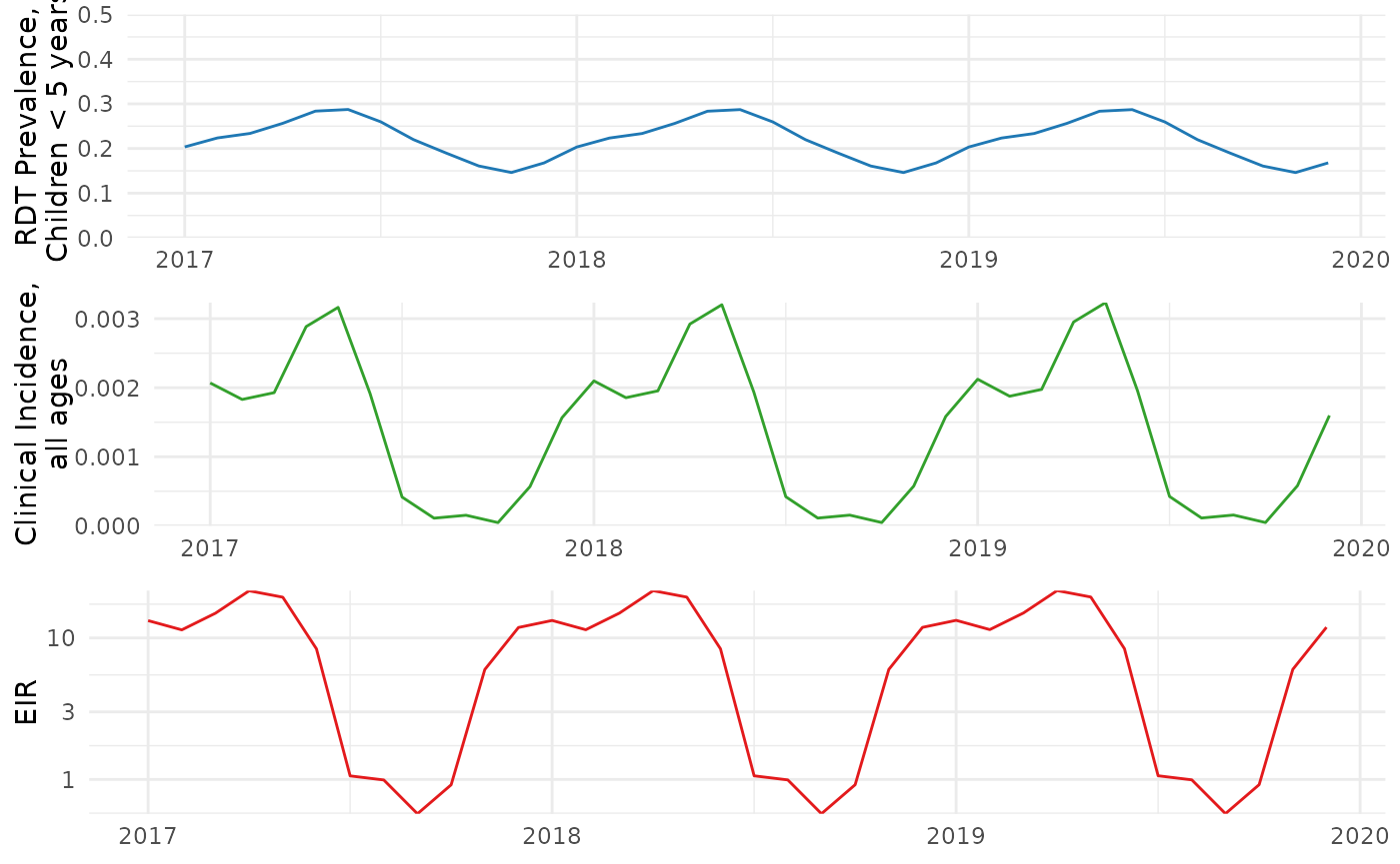
Input Data
The only user input required for running anatembea is a data frame of monthly prevalence with at least three columns:
-
month: Month (here formatted as ‘yearmon’, provided by the package ‘zoo’) -
tested: The number of individuals tested -
positive: Of those tested, the number of positive test results
In our example, the data frame tanga_data_slim was
generated by sampling binomially from the target infection prevalence of
the simulation presented above using a monthly sample size of 1000
children.
tanga_data_slim <- anatembea::sim_data_tanzania%>%
  dplyr::select(month,positive,tested)%>%
  dplyr::filter(month<=zoo::as.yearmon('Dec 2019'))
head(tanga_data_slim, 5)
#>      month positive tested
#> 1 Jan 2017      204   1000
#> 2 Feb 2017      224   1000
#> 3 Mar 2017      234   1000
#> 4 Apr 2017      256   1000
#> 5 May 2017      284   1000
Running a pMCMC fitting
The run_pmcmc function is the central tool to fit our
model to observed data. It formats the provided data set, sets up
required functions and parameters, and finally runs the pMCMC. Broadly,
the flow of actions is as follows:
- Process provided data set, specifically formatting necessary time variables.
- Format and declare parameters. These include both constant or known parameter values needed for malariasimulation as well as pMCMC parameters that will be fit.
- Set particle filter and pMCMC settings.
- Run the pMCMC.
- Format output.
By default, in the absence of other contextual information, we use
the first year’s prevalence (total number of positives in the first year
divided by total number of tested in the first year) to calibrate
initial pre-observation transmission and immunity, minimising potential
seasonal biases of a shorter calibration window. However,
anatembea provides functionality for the user to adjust this
assumption. In the example below, we will assume that, on average before
data collection, prevalence in children under 5 was 0.4, as specified in
the option target_prev.
Other optional user parameters include pMCMC particles/step/chains, the maximum mosquito emergence rate, and treated fraction of clinical cases. No rainfall or other environmental data are required. For available options, see package documentation.
result <- anatembea::run_pmcmc(data_raw=tanga_data_slim,
                               target_prev = 0.4,
                               n_particles=100,
                               n_steps = 10)
#> ── R CMD INSTALL ───────────────────────────────────────────────────────────────
#> * installing *source* package ‘odin.model.stripped.seasonal12e978e6’ ...
#> ** this is package ‘odin.model.stripped.seasonal12e978e6’ version ‘0.0.1’
#> ** using staged installation
#> ** libs
#> using C compiler: ‘gcc (Ubuntu 13.3.0-6ubuntu2~24.04.1) 13.3.0’
#> gcc -std=gnu2x -I"/opt/R/4.6.0/lib/R/include" -DNDEBUG   -I/usr/local/include    -fpic  -g -O2  -UNDEBUG -Wall -pedantic -g -O0 -fdiagnostics-color=always -c odin.c -o odin.o
#> odin.c: In function ‘odin_model_stripped_seasonal_initial_conditions’:
#> odin.c:2309:10: warning: unused variable ‘t’ [-Wunused-variable]
#>  2309 |   double t = scalar_real(t_ptr, "t");
#>       |          ^
#> gcc -std=gnu2x -I"/opt/R/4.6.0/lib/R/include" -DNDEBUG   -I/usr/local/include    -fpic  -g -O2  -UNDEBUG -Wall -pedantic -g -O0 -fdiagnostics-color=always -c registration.c -o registration.o
#> gcc -std=gnu2x -shared -L/opt/R/4.6.0/lib/R/lib -L/usr/local/lib -o odin.model.stripped.seasonal12e978e6.so odin.o registration.o -L/opt/R/4.6.0/lib/R/lib -lR
#> installing to /tmp/RtmpII5WsC/devtools_install_1c0355461132/00LOCK-file1c0377e4f5e7/00new/odin.model.stripped.seasonal12e978e6/libs
#> ** checking absolute paths in shared objects and dynamic libraries
#> * DONE (odin.model.stripped.seasonal12e978e6)
#> Unused equation: age_flex_length
#>  age_flex_length <- user(integer=TRUE) # (line 485)
#> Optimizing initial EIR based on target prevalence.
#> Initial EIR set to 29.3.
#> Running chain 1 / 1
#> Finished 10 steps in 48 secs
#> pMCMC completed in 53.2 seconds
Visualising output
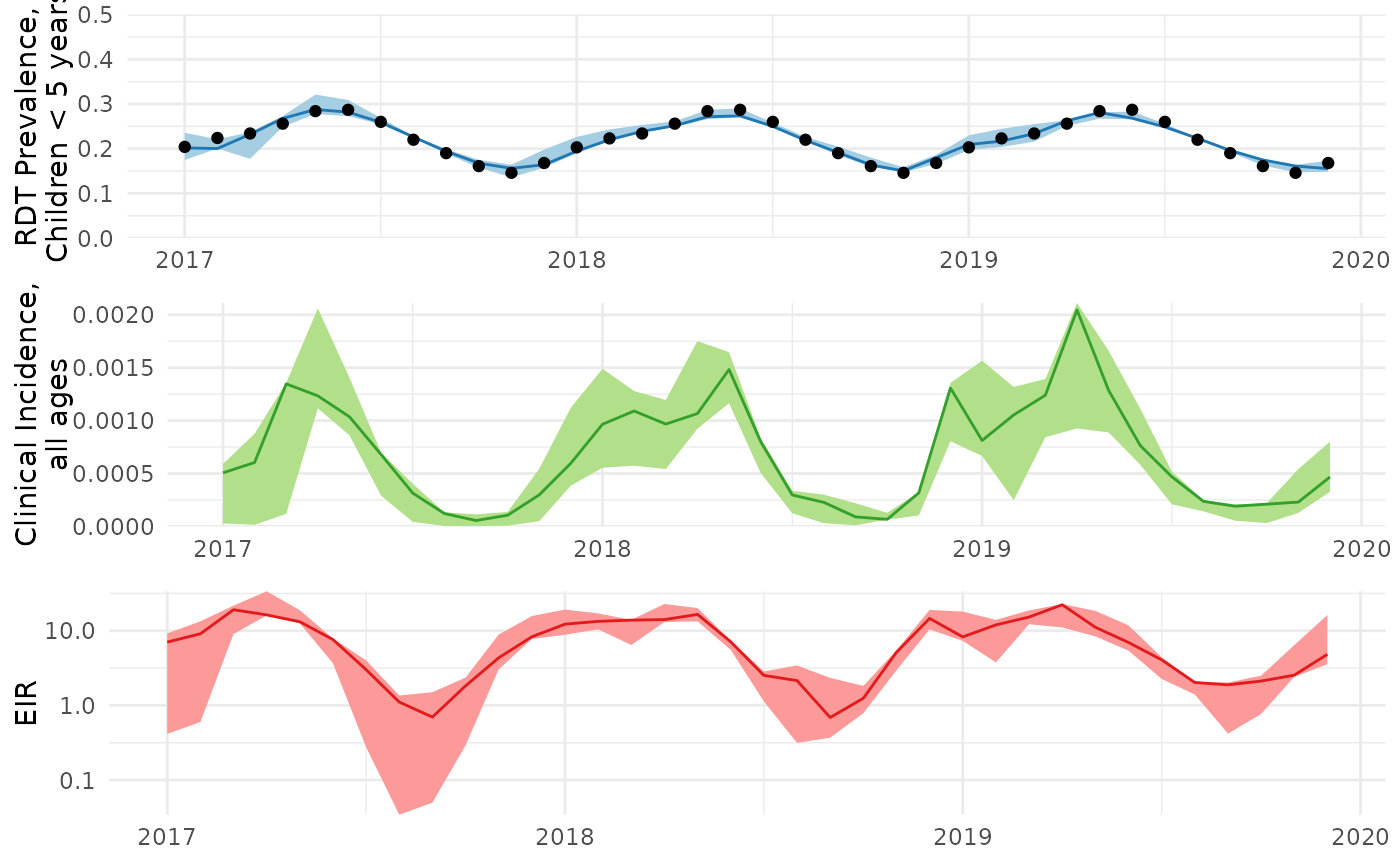
We can then visualise how well the pMCMC fit to the prevalence data, as well as unobserved transmission metrics like clinical incidence in the entire population and the entomological inoculation rate (EIR).
First we’ll perform some simple diagnostics, including visualising the MCMC trace and calculating the acceptance rate and effective sample size.
measure_names <- c('prev_05','clininc_all','EIR','betaa')
months <- tanga_data_slim$month

timelength <- length(months)
num_months <- length(result$history[1,1,])
start_month_index <- (num_months-timelength+1)

mcmc <- result$mcmc[,]
ar <- 1 - coda::rejectionRate(coda::as.mcmc(mcmc))
ess <- coda::effectiveSize(coda::as.mcmc(mcmc))

pars_list <- names(mcmc)
trace_plots <- lapply(pars_list, function(x){
  bayesplot::mcmc_trace(mcmc,pars = x) +
    ggtitle(paste0(x,' / AR: ',round(ar[x],3),' / ESS: ',round(ess[x],1)))+
    theme(title = element_text(size=6),
          axis.title.y = element_blank())
  })
trace_plots
#> [[1]]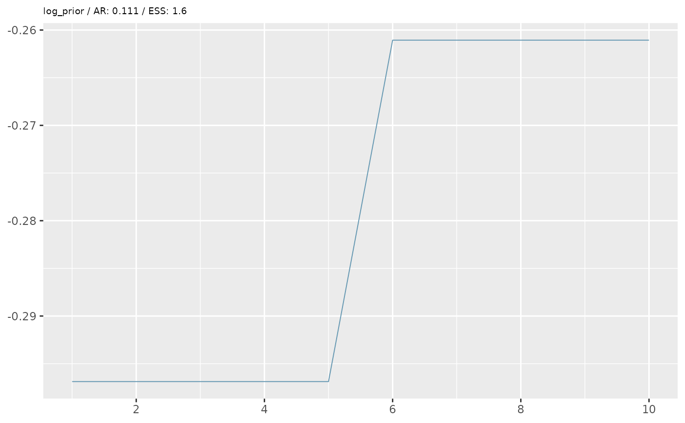
#>
#> [[2]]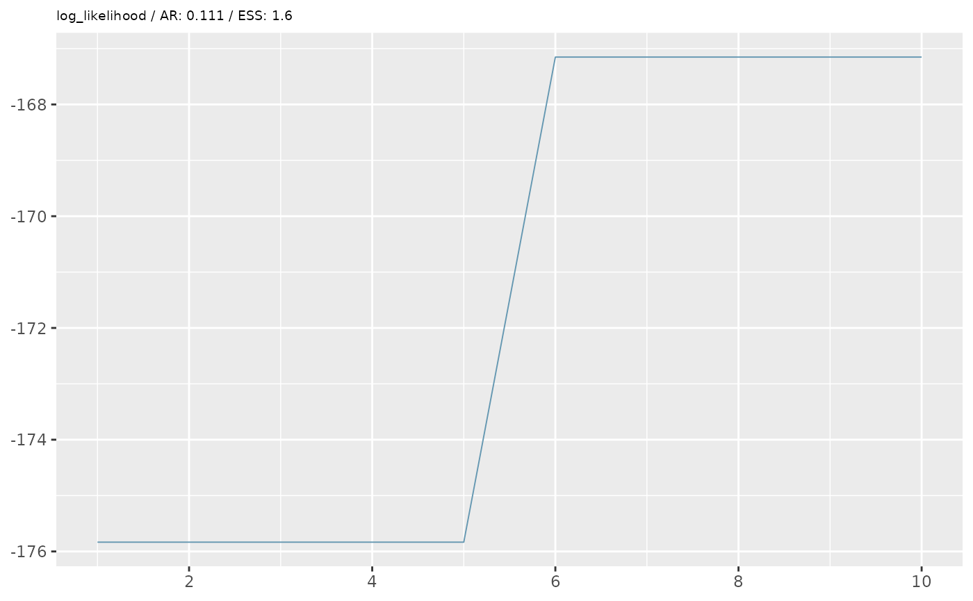
#>
#> [[3]]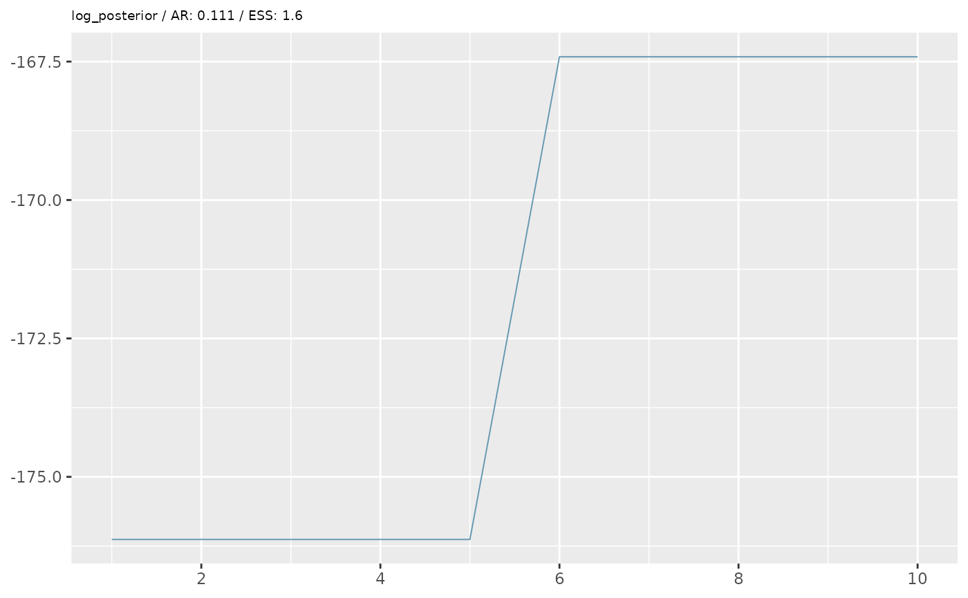
#>
#> [[4]]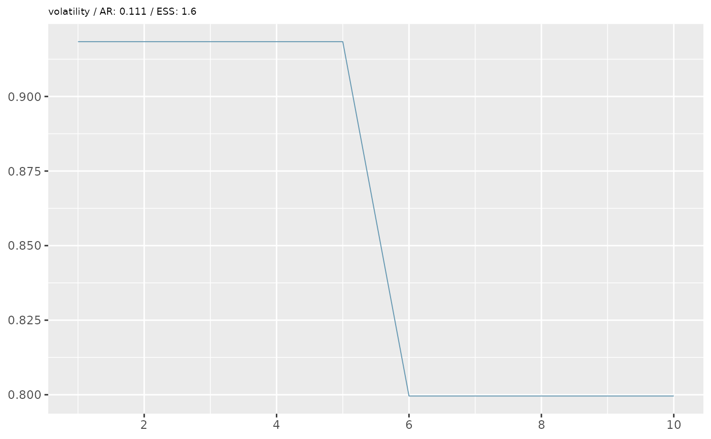
In the example above, our diagnostics don’t look great. We want an
acceptance rate around 20% and an ESS of at least 200 (the higher the
better). However, based on some simplified options we’ve given, we are
unlikely to achieve good performance. Besides the data
(data_raw) and target_prev, when we ran the
pMCMC, we also specified two additional options, which set the number of
particles (n_particles) and the number of MCMC iterations
(n_steps) for the pMCMC algorithm. We gave lower numbers
than advised for a real analysis to avoid lengthy computational times
for this example. A good starting point for an initial run is about 200
particles and at least 1000 steps (although for a final analysis, the
number of steps may be above 10,000 to ensure MCMC convergence and
proper mixing).
Even though our MCMC doesn’t look great, let’s still visualize the model fit to the data:
history.dfs <- lapply(measure_names,function(x){
  as.data.frame(t(result$history[x,,start_month_index:num_months]))%>%
        dplyr::mutate(month=months)%>%
    reshape2::melt(id='month')%>%
    dplyr::group_by(month)%>%
    dplyr::summarise(median=median(value),
              upper=quantile(value,probs=0.975),
              lower=quantile(value,probs=0.025))%>%
    dplyr::mutate(measure=x)
})
names(history.dfs) <- measure_names

prev_plot <- ggplot(data=history.dfs[['prev_05']])+
  geom_ribbon(aes(x=month,ymin=lower,ymax=upper),fill="#A6CEE3")+
  geom_line(aes(x=month,y=median),color="#1F78B4")+
  geom_point(data=tanga_data_slim,aes(x=month,y=positive/tested),fill='black')+
  scale_y_continuous(limits=c(0,0.5),expand=c(0,0))+
  labs(y='RDT Prevalence,\nChildren < 5 years')+
  theme_minimal()+
  theme(axis.title.x = element_blank())

inc_plot <- ggplot(data=history.dfs[['clininc_all']])+
  geom_ribbon(aes(x=month,ymin=lower,ymax=upper),fill="#B2DF8A")+
  geom_line(aes(x=month,y=median),color="#33A02C")+
  scale_y_continuous(limits=c(0,NA),expand=c(0,0))+
  labs(y='Clinical Incidence,\nall ages')+
  theme_minimal()+
  theme(axis.title.x = element_blank())

eir_plot <- ggplot(data=history.dfs[['EIR']])+
  geom_ribbon(aes(x=month,ymin=lower,ymax=upper),fill="#FB9A99")+
  geom_line(aes(x=month,y=median),color="#E31A1C")+
  scale_y_log10(expand=c(0,0))+
  labs(y='EIR')+
  theme_minimal()+
  theme(axis.title.x = element_blank())

combined_ggplot <- cowplot::plot_grid(prev_plot,inc_plot,eir_plot,ncol=1)
# combined_ggplot <- prev_plot+inc_plot+eir_plot+plot_layout(ncol=1)
result$output <- combined_ggplot
result$output